
Overview
With the App Builder components, one can control the skeleton of a web application directly from Grasshopper. After the Grasshopper definition is uploaded, it can be opened as a ShapeDiver App, which reflects the logic and organization defined by those components. ShapeDiver currently provides one template that interprets the application’s skeleton into a fully responsive layout. In the future, other templates will be available.
What is the skeleton of a web application?
We call the skeleton of a web application the abstract description of its hierarchy and logic without considering things such as sizes and positions, colors, fonts, etc…
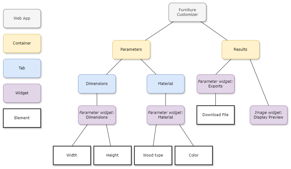
The skeleton can be represented by a tree where nodes consist of a set of different bricks helping to build and organize the web application. At the moment, the App Builder is able to define
-
The App is the top-level node from which all other nodes depend. It has a name and a list of containers.
-
Containers are the first hierarchy level inside the app. They have a name and can include a list of tabs and/or widgets. Tabs are optional: a container can only include a list of widgets and skip the tabs level of the hierarchy.
-
Tabs are a way to divide containers into several parts. In the final application, they could be represented by tabs in the container, different boxes, steps in a configurator, etc. Tabs are defined by a name and a list of widgets.
-
Widgets are UI elements specialized for a specific purpose. In the first version of the App Builder tools we introduce below, we have included parameter widgets, image widgets, and text widgets. Chart and legend widgets are planned, and potentially many more in the future. A widget has various custom properties and can include or not lists of elements. For example, a parameter widget includes a list of parameter elements. An image widget does not include any further elements but contains custom properties used to define the image.
-
Elements are the lowest elements in the hierarchy. Element is a generic term that can cover many unit layout items. In the first version of our application building tools, only two elements are included (parameter elements and export elements).
Here is an example:
Define a skeleton using the App Builder components
The ShapeDiver plugin includes an “App Builder” category, which closely mirrors the various skeleton elements described above. In other words, the components can be used to define the skeleton tree explicitly.
First example
Consider the following Grasshopper definition:
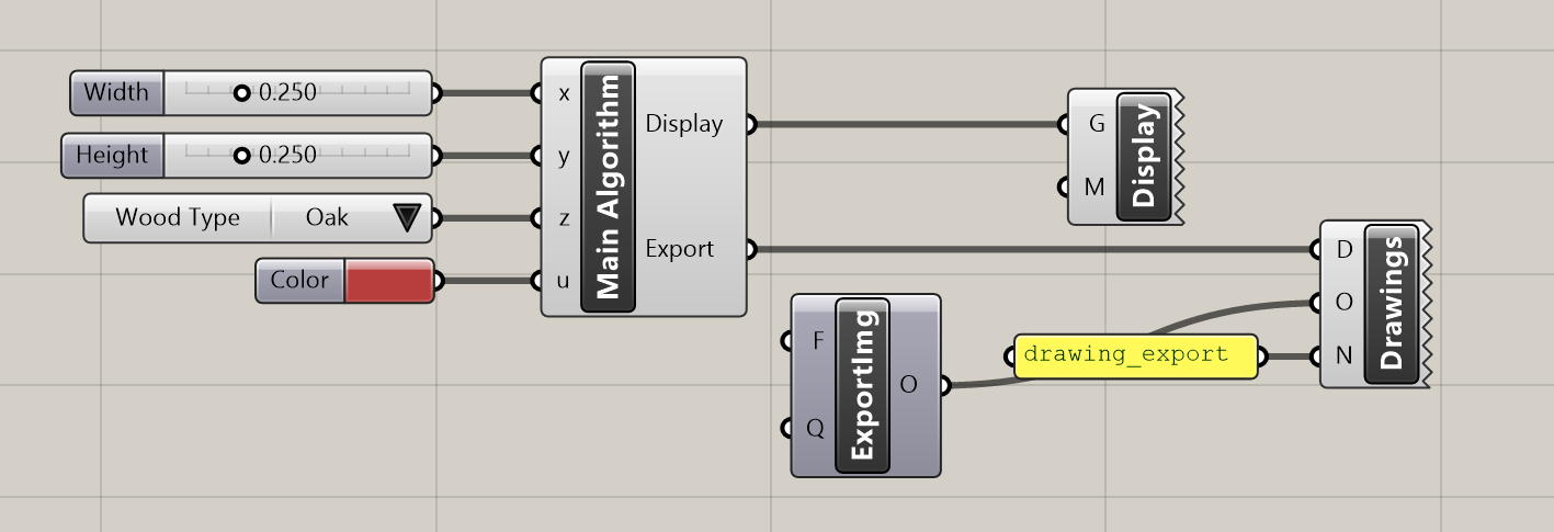
Four parameters (“Width, “Height”, “Wood Type” and “Color”) are used as inputs for an algorithm which produces two outputs: geometry to display in the viewer (using a Display component) and a bitmap asset which is sent to a ShapeDiver Export component called “Drawings”.
This definition can be uploaded to ShapeDiver as is and opened as a ShapeDiver App, with the standard interface. But it can also be extended with the App Builder components to create an application according to the skeleton above:
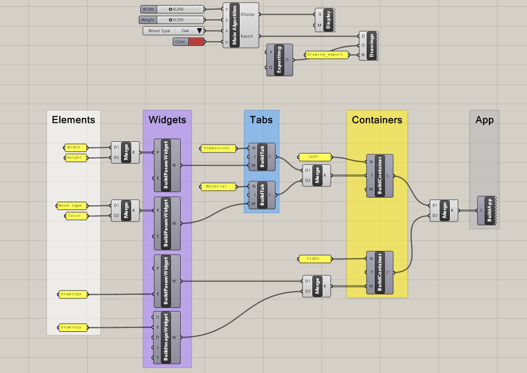
Note how the components are used to re-create the tree defined above. Note also how the various parameters and export elements used in the widgets are referencing the names of existing parameters of the definition, used to control the core algorithm.
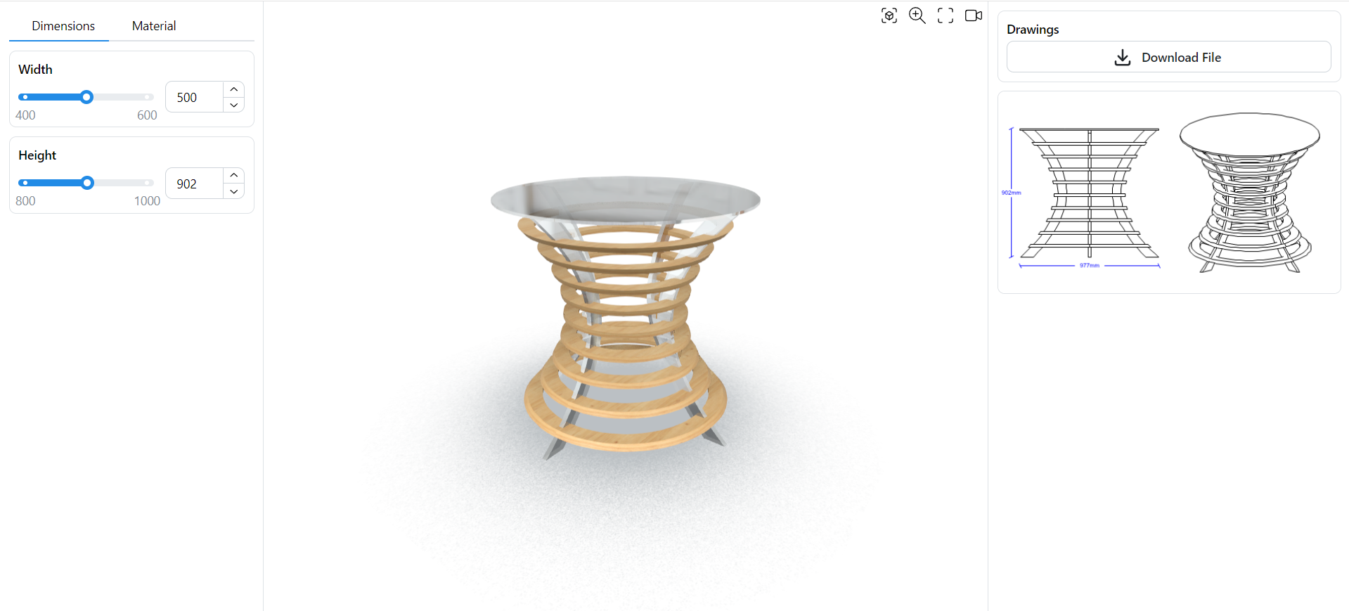
See the corresponding App here.
At the moment, the first App Builder template only accepts containers with the names “left”, “right”, “top” and “bottom” (see section below). The names of containers in the definition above follow this scheme instead of the names “Parameters” and “Results” of the tree.
Parametric interfaces
Since the skeleton is controlled through Grasshopper, it can be parametric and depend on the state of the associated model. This allows to do such things as:
-
Update the layout of the application depending on user inputs
-
Only show relevant parameters and hide the unused ones in the current state
-
Use widgets to display data, graphs, images and more that reflect the current state
-
And much more…
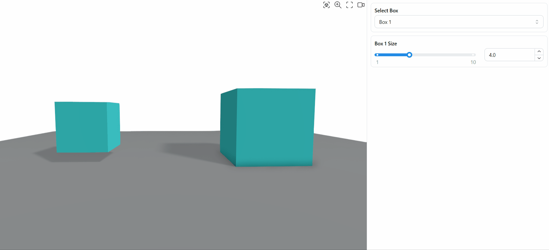
As an example, consider the following definition:
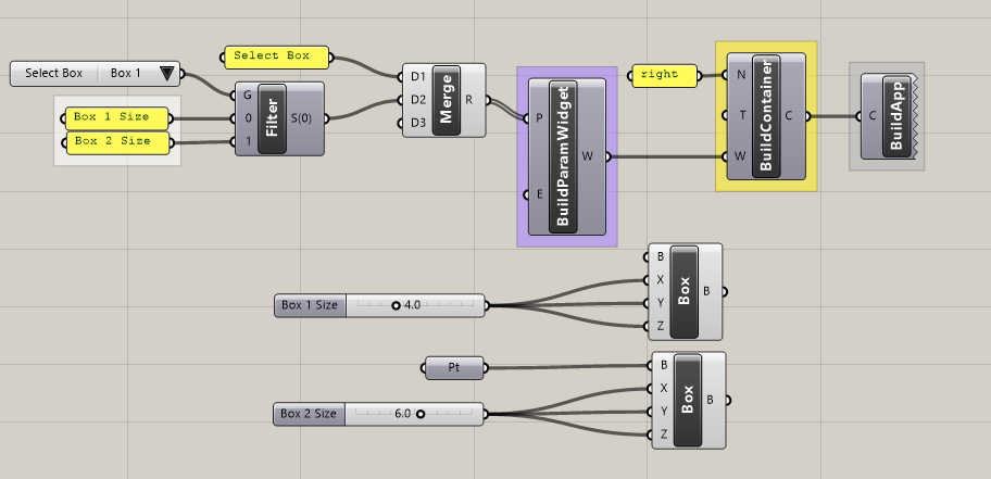
Through the “Select Box” toggle and a stream filter, one is able to control the contents of the “right” container to either show the “Box 1 Size” parameter or the “Box 2 Size” one. See the corresponding App here (using the default template).
Read more about the App Builder components and their various options in the plugin’s App Builder section.
Connect to a specific template
Grasshopper definitions including App Builder components only contain information about the skeleton but no information on how to translate the logic and information of the skeleton into a concrete layout on a device’s screen.
In the example above, the application contains two containers (Parameters and Results), but it does not say where to place those containers on the screen, with which dimensions, or what happens on mobile screens, among other considerations.
A template is a pre-defined layout that implements a specific organization and set of rules to interpret a skeleton on a screen. A template will typically look for a specific naming scheme in the skeleton (names of containers, tabs…) and execute a specific behaviour when it finds the associated name. For example, a specific “Furniture App Template” could always expect a container named “Parameters” and display it on the left of the screen, with a width of 300px, and a container named “Results” and display it on the right.
At the moment, ShapeDiver includes a first default template that expects four container names (“top, “left,” “right,” and “bottom”) and interprets them in a flexible, responsive layout. Here is how the default template is organized on a desktop screen:
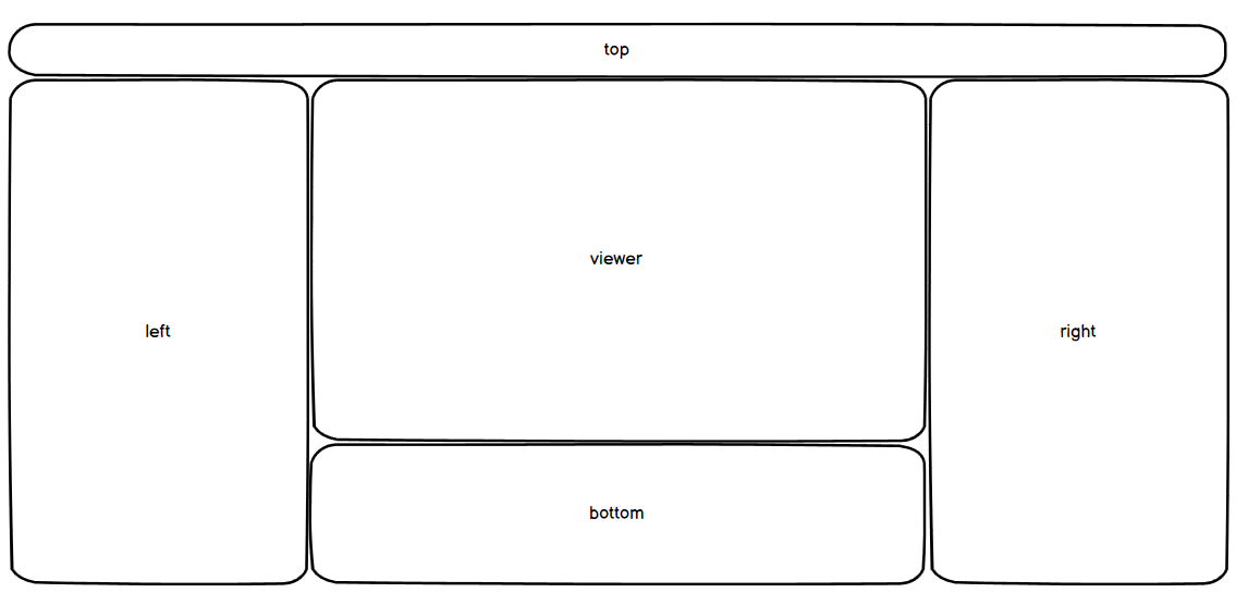
This layout is responsive and adapts to various screen sizes and depending on the visibility of the various containers defined in Grasshopper.
In the initial phase of App Builder, the layout rules of the default template will evolve frequently. We will document them in more details once they become final.
Additionally, more templates will be developed in the future, covering different use cases.
Themes and styling options
The layout defined through a template still does not contain information about the last layer of the web application: styling. Things such as the colors of various elements, the font settings, and other properties that web developers usually control with CSS can still be modified without affecting the layout.
Each App Builder template comes with a theme, which provides default values for these styling options. However, it is always possible to customize the theme according to one’s tastes or a company’s specific branding. Read more about how to customize a theme in this article.
The ShapeDiver platform will include a theme editor in the future as a user-friendly way to customize themes. For now, the associated article describes a workaround that already allows full control over the theme’s styling options.