We list in this article all the Grasshopper components which are turned into inputs of a ShapeDiver model. In other words, by including these components in a definition before uploading it, the online model will expose them as ways to remote control the definition.
Including any inputs in a definition will expose them to the legacy model page and its associated App using the legacy ordering and grouping principles. Alternatively, the App Builder components will give you more control of those settings and many others.
Included inputs are also exposed to the APIs.
Supported inputs
Native Grasshopper inputs
The table below lists the native Grasshopper components from the Params > Input category which are supported in ShapeDiver, and the corresponding ShapeDiver UI element that will be automatically included in the online model:
|
Element |
Supported native properties |
Additional App Builder properties |
|---|---|---|
|
Number slider |
The following properties of the slider defined in Grasshopper are respected:
|
See Slider Settings |
|
Value List |
|
|
|
Boolean Toggle |
|
|
|
Color Swatch / Color Picker |
|
|
On top of the input-specific properties mentioned in the table above, the default value of each component is also respected after uploading the model to ShapeDiver.
If you are using App Builder, the Parameter Control component allows to override several of the native properties and to set additional specific App Builder ones.
Including any other native Grasshopper inputs (from the Params > Input category) will not prevent the file being uploaded to ShapeDiver, but these inputs will not translate into exposed controls of the online ShapeDiver model.
ShapeDiver Direct Text Input component
The Direct Text Input component of the ShapeDiver plugin turns into a text input field on the platform which lets users of the model type in a text and use it as an input.
ShapeDiver Import components
The ShapeDiver plugin contains 4 different Import components:
When included in a definition, each of them turns into a file input element in the platform, which lets users of the model click and select a file in their local system.
Each component lets you specify a maximum allowed file size as well as allowed file types. Read more about these components in the Input section of the plugin documentation.
Use floating parameters as structured inputs
Almost any data type in Grasshopper can be used as a structured data input. In order to define such inputs, one should add a floating parameter of the desired data type and give it a name starting with the SD_ prefix.
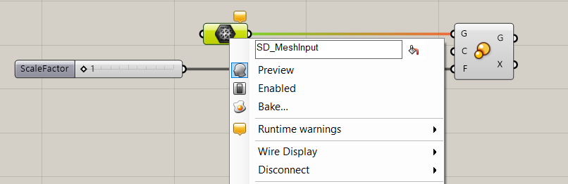
For a ShapeDiver model, this means that it is possible to send data to this input directly to the model from a variety of so-called desktop clients, such as Rhino itself but also other software like Adobe Illustrator. The platform will turn structured inputs into buttons allowing to enable the selection mode in the active desktop client. The name of the platform input removes the prefix defined in Grasshopper:
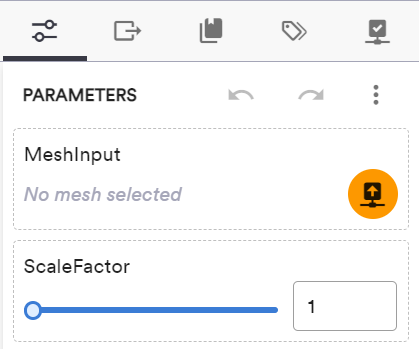
You can read more about how to connect to a desktop client from the platform and send data from there to the platform in this article.
Naming inputs
The name of the corresponding Grasshopper components is used as a label for the UI element in the online platform. See below an example for number sliders:

If you are using App Builder, display names can be overridden using the Parameter Control component.
Ordering, grouping and visibility
Using App Builder
We recommend using App Builder components to control the layout of ShapeDiver Apps, including advanced control for ordering and grouping inputs.
The following sub-paragraphs only include information about legacy models that are not making use of App Builder components.
[LEGACY] Ordering and grouping
If you are not using App Builder, the position of input components on the canvas as well as native Grasshopper groups are used to define the order of parameters in the online platform and group them in separate sub-categories by means of accordions. Read more about ordering and grouping inputs.
[LEGACY] Ignore inputs
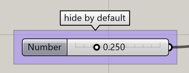
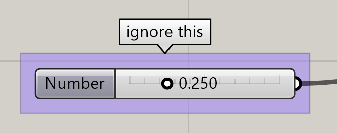
In case you want to use native Grasshopper components from the Params > Input category that should not show up as parameters when uploading your model to ShapeDiver, you can put them into a group whose name starts with ignore (case insensitive).
[LEGACY] Hide inputs
If you put inputs into a group whose name starts with hide or hidden (case insensitive), the inputs will be hidden by default when uploading your model to ShapeDiver.