
The Value List Item Data component can be used to customize specific item properties of value lists when building Apps with the App Builder framework.
The component can be used along with the Value List Settings component to create a settings object and assign it to a value list in the App.
First example
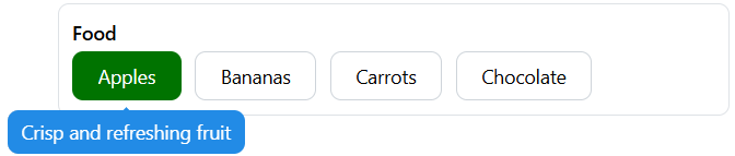
The following definition contains a single value list input called “Food”, with four options:
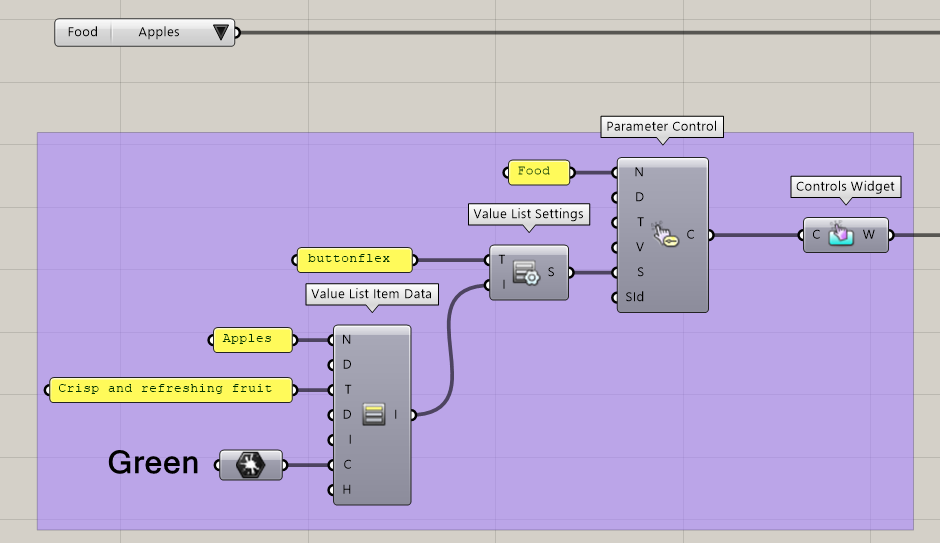
In our App, we include the “Food” parameter be define custom settings. We choose the buttonflex type for the UI element and define properties for the “Apples” option of the value list: a tooltip and a color. Below is the result as displayed in the App:
Available properties
The component’s first input (Name) can be used to reference a specific value list item. The other inputs of the component correspond to properties that can be defined.
Note that some properties are only compatible with specify value list type values, as defined by the Value List Settings component. We mention restrictions below and also provide an handy compatibility table here.
-
DisplayName (optional): An alternative name used to display the option in the App.
-
Tooltip (optional): A tooltip to display when hovering over the option. Compatible with all types except
dropdown. -
Description (optional): A description text to be displayed along with the option. Compatible with types
carousel,fullwidthcards,gridandimagedropdown. -
ImageUrl (optional): The url of an image to be displayed along with the option. Compatible with types
carousel,fullwidthcards,gridandimagedropdown. -
Color (optional): A color associated with the option. In the case of the
colortype, this defines the option’s solid color. Alternatively, this property defines a border color for the typescarousel,fullwidthcards,gridandimagedropdown. -
Hidden (optional): The visibility of the option. When
false, the option is hidden from the value list in the App.