
The Value List Settings component can be used to customize the way value lists are displayed in the interfaces of Apps built with the App Builder components.
The component creates a Settings object which can be sent to the Parameter Control component to override settings of the referenced parameter.
In the future, other settings components will be included in the plugin, providing settings for other types of parameters (sliders, color swatches, interaction inputs, etc…)
Value List Types
The first input of the component is a string identifying the type of UI element the value list should use in the App. When placing the component on the canvas, it also instantiates a value list with the possible Type values:
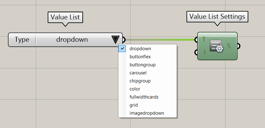
For each type, find in the table below a screenshot example and the list of Item Data they support.
Item data
Several types support additional item-specific data such as images, tooltips, colors…
Such item data can be defined using the Value List Item Data component and included in the Value List settings.
Read more about the Value List Item Data component.
|
Value List Type |
Example |
Supported Item Data* |
|---|---|---|
|
dropdown (default) |
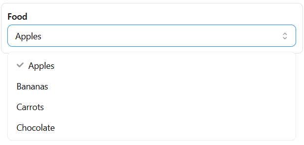
|
- |
|
buttonflex |
|
tooltip color |
|
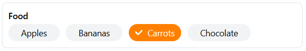
buttongroup |
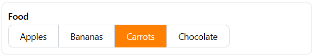
|
tooltip color |
|
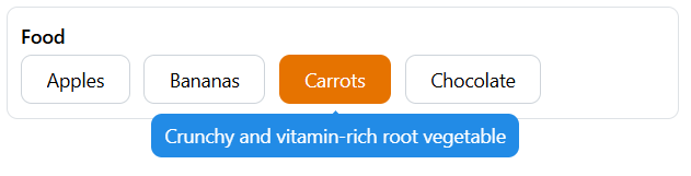
carousel |
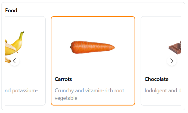
|
tooltip description imageUrl color (applies to the border) |
|
chipgroup |
|
tooltip color |
|
color |
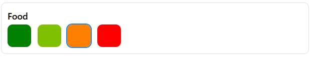
|
tooltip color |
|
fullwidthcards |
|
tooltip description imageUrl color (applies to the border) |
|
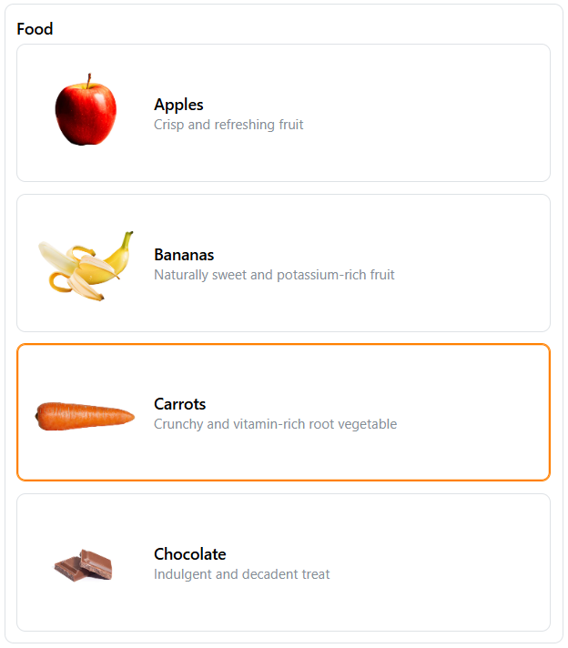
grid |
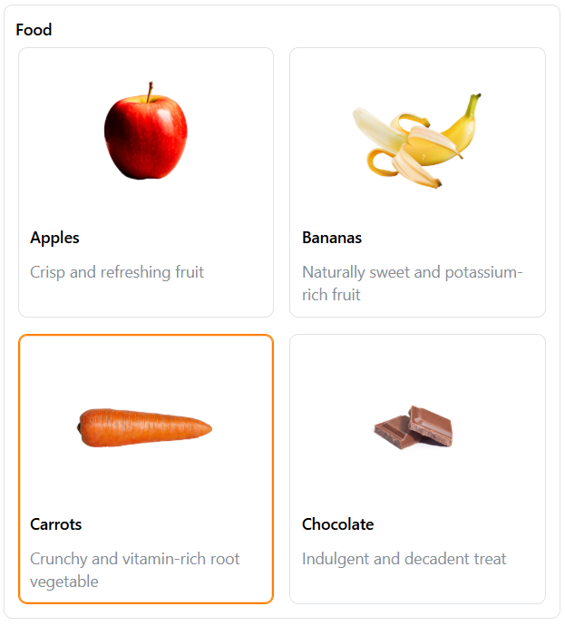
|
tooltip description imageUrl color (applies to the border) |
|
imagedropdown |
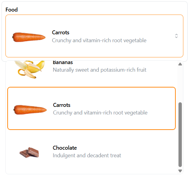
|
tooltip description imageUrl color (applies to the border) |
* This table does not mention the following properties, because they are supported by all types: DisplayName, Hidden