
The Parameter Control component can be used to reference one of the definition inputs in an App built with the App Builder components. The component links to a definition input using its name and allows overriding several of the properties defining the control in the final App.
The created control can then be included in a Controls Widget within the App.
First example
In the example below, we show a minimal definition including one slider called “Radius” controlling the radius of a sphere.
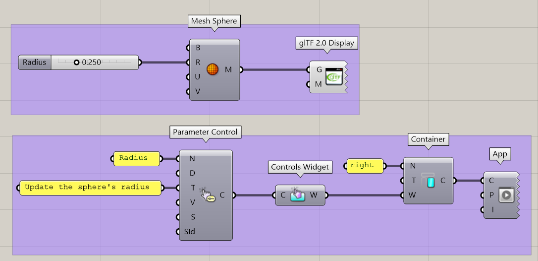
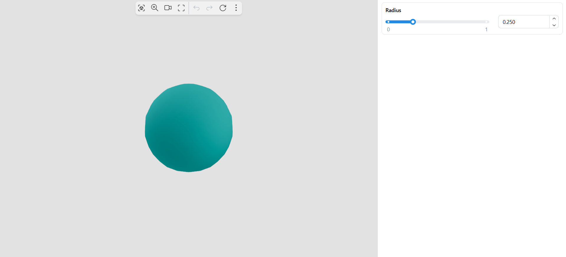
Using the App Builder components, we create an App with a single Container on the right. In this container, we define a single Controls Widget, which itself contains one single Parameter Control. The Parameter Control references the “Radius” slider by its name and defines a tooltip for the control in the App. The resulting App looks like this using the default template:
Properties
In addition to the Name input, the following inputs can be used to customize the control:
-
Display Name (optional): Defines a custom name for this parameter control in the App
-
Tooltip (optional): Add a tooltip to this parameter control in the App
-
Validation: If true, updating the control in the App will only happen after clicking on an “Accept” button
-
Settings (optional): Additional parameter-specific settings as defined using one of the Parameter Settings components (see section below).
-
SessionId (optional): The Id of the App session this parameter is linked to. Leave empty when using a single session.
Parameter-specific settings
Several utility components allow to override settings relative to specific parameter types.
As an example, the Value List Settings component can be used along with the Value List Item Data component to add images and descriptions to items of a value list.
More settings components will soon be added to the plugin.