
Overview
Use the Container component to define “ShapeDiver App Container” objects. Containers are the top-level building blocks in the skeleton of a ShapeDiver App: you define an App with several Containers, and each Container can include one or more child parts (Tabs and Widgets).
Read more here about the App Builder and how you can use it to drive web applications from Grasshopper.
Use this component to create static containers that occupy a docked space on the screen and restrict the size of the viewer canvas. To create containers that float on top of the viewer canvas, use the Floating Container component.
First example
For example, create a container named right that contains two tabs named Geometry and Materials:
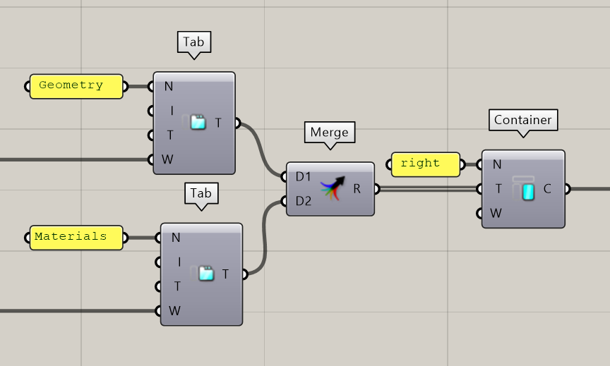
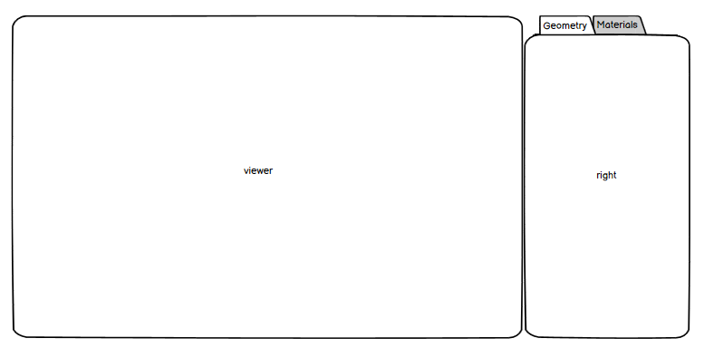
The template you use determines how the ShapeDiver App displays this configuration. In the default template, the desktop layout looks like this:
Properties
Define a “ShapeDiver App Container” object with three properties:
-
A Name that identifies the container. Use any name, but note that some ShapeDiver templates might require specific names to build their layout. For example, the default template accepts four reserved names:
top,bottom,left, andright. -
A list of Tabs.
-
A list of Widgets to include in the container. Both Tabs and Widgets are optional inputs, but you need to define at least one of these inputs for the component to create a valid container.
Tabs or Widgets
As a general rule, use tabs as an intermediary building block between containers and widgets. However, you can define widgets directly inside containers in the following use cases:
-
You do not need to organize the container contents into separate tabs.
-
You need to display one or more widgets regardless of the currently active tab. In the default template, widgets included directly in containers are always displayed at the bottom.
Outputs
Connect the “ShapeDiver App Container” object to the App component. Define an App with a list of Containers.