
The Tab component is used to define so-called “ShapeDiver App Tab” objects. Tabs are one of the elements that can be included inside a Container, along with Widgets. As their name suggests, tabs are meant to divide a container in sections which can be browser through a tab menu. However, depending on the template used, they could translate into another layout style.
Read more here about the App Builder and how to use it to drive web applications from Grasshopper.
Inputs
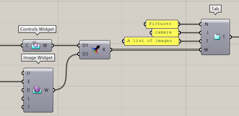
Using the Tab component, one can define a “ShapeDiver App Tab” object using four properties:
-
A Name identifying the container (required). While any name is possible, some ShapeDiver templates might require specific names in order to build their layout. In the default template, any name can be used and will be displayed in the layout.
-
An Icon name (optional). If an icon name is provided, it will be displayed alongside the name in compatible templates.
-
A Tooltip (optional). This tooltip will be displayed in the tab when hovering over it.
-
A list of Widgets (required). At least one widget needs to be provided to create a Tab object.
As an example, the following definition defines a tab named Pictures with the icon camera, a tooltip saying “A list of images.” and containing two widgets (one Controls Widget and one Image Widget).
List of available icons
ShapeDiver Apps rely on the Tabler icon library. Search for icons and just use their exact name as input to the Tab component.