
The Image Widget component can be used to include images in the layout of Apps created with the App Builder components. Like other Widgets, Image Widgets can be included inside Tabs of the App, or directly into Containers. Images can either reference a public URL or an Export component in the definition which contains a parametrically created bitmap.
Referencing a public URL
Use the “URI” (U) input of the component to specify a publically available location where the image you want to include is stored. Consider the following definition:
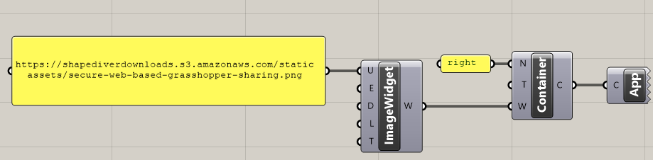
Using the default template, it defines a simple application with one right container, which includes an image widget with the specified URL. The application looks like this:
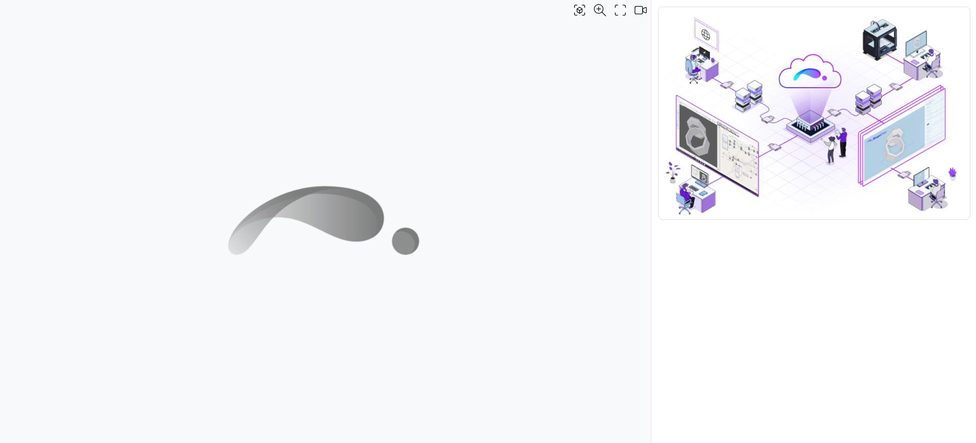
Note that the viewer container is empty because the definition does not define any display geometry.
Referencing an Export component
The ShapeDiver plugin allows the manipulation of bitmap objects directly in Grasshopper by means of specific components, the Squid plugin, and other third-party plugins like Bitmap+.
Once a bitmap object is created in the definition, it can be displayed in the Image Widget by means of a Download Export component. Essentially, the Download Export component exports the image in the web application's background and shows it directly in the interface.
In order to make the connection, simply reference the name of the Export component in the “Export Name” (E) input of the component. Consider the following definition:
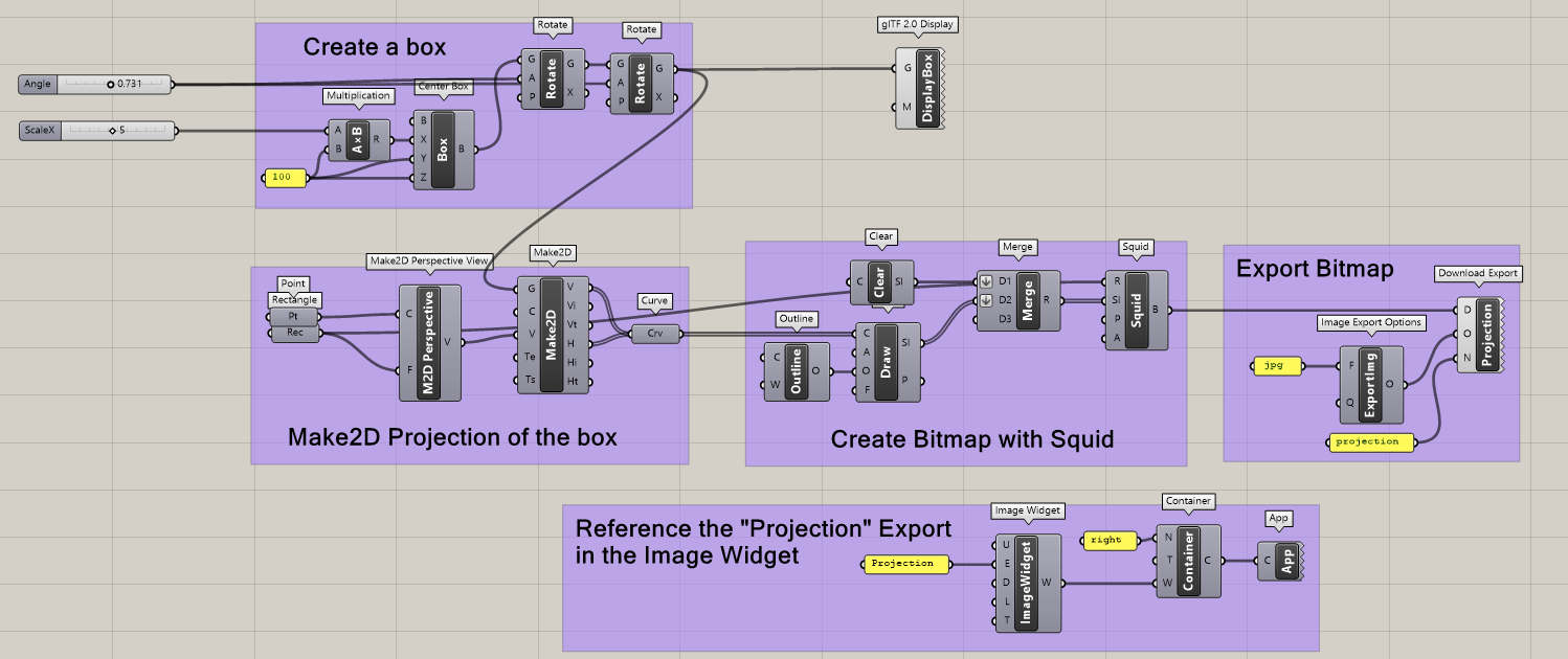
First, we create and display a box in the viewer.
Second, we project the box with the Make2D component and draw a bitmap using the Squid plugin.
Third, we use the Download Export component to export the bitmap to a jpg.
Finally, we reference our Download Export component (called “Projection” in the example) in the “Export Name” (E) input of the Image Widget component.
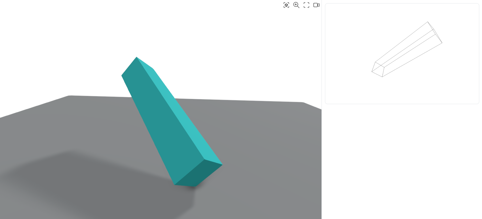
The final application looks like this:
Download the Grasshopper definition of this example.
Extra credits are spent when using the Export components. Read more information about export requests and the credits they incur here.
Specify an image description
Use the “Description” (D) input of the component to add a description to the image. This description is used to generate the alt property of the image in the web application. Read more about this topic here.
Add a link to the image
You can make the image clickable by specifying a URL in the “Link” (L) input of the component. Users of the App will then be able to click on the image to follow the specified link.
Additionally, use the “Target” (T) input to specify what happens when clicking on the image. By default, the target is _blank, which means the link is opened in a new tab of the web browser.
Sizing
Depending on the template you are using, the image will be sized for the best possible fit in the layout.
If you are using the default template, images in the left and right Containers will be resized to fit the width of the containers and keep their original ratio. Images in the top and bottom Containers will be resized to fit the height of the containers and keep their original ratio.