
The Controls Widget component can be used to expose various controls for the end users of an App created with the App Builder components.
Controls can take the form of various inputs, such as sliders, value lists, and color swatches… as well as buttons triggering file exports, data transfers, and various actions.
First example
The main algorithm from the definition below simply creates a parametric sphere from a single Radius slider input. The sphere is shown in the App using the glTF 2.0 Display component, and a Download Export component is included to let users of the App download the resulting 3dm file.
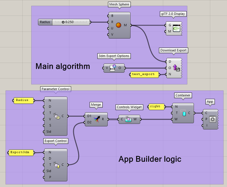
From this definition, we build a simple App using App Builder components. The created App includes a single right Container, itself containing only one Controls Widget.
The Controls Widget includes a list of two controls:
-
One Parameter Control referencing the “Radius” slider.
-
One Export Control referencing the Download Export component (whose name is set to “Export3dm”).
Component input
The component includes a single input accepting a list of App Builder Controls. Any control component can be used, and it is possible to mix different types of control (see example above). Controls are displayed in the App following the order of the list of controls included in the component.
Component output
The component's widget output can be used within a Single Accordion Widget, a Tab, or directly in a Container.