Text Widget
The Text Widget component can be used to include text panel in the layout of Apps created with the App Builder components. Like other Widgets, Image Widgets can be included inside Tabs of the App, or directly into Containers. The component supports plain text but also github-flavored markdown with a ShapeDiver-specific extension to define colors and formatting styles that are not included in standard markdown.
Overview
The component includes a single text input and outputs a widget that can be included in the App's layout.
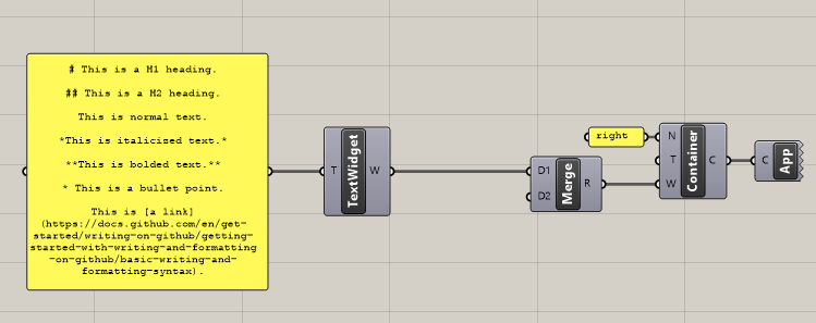
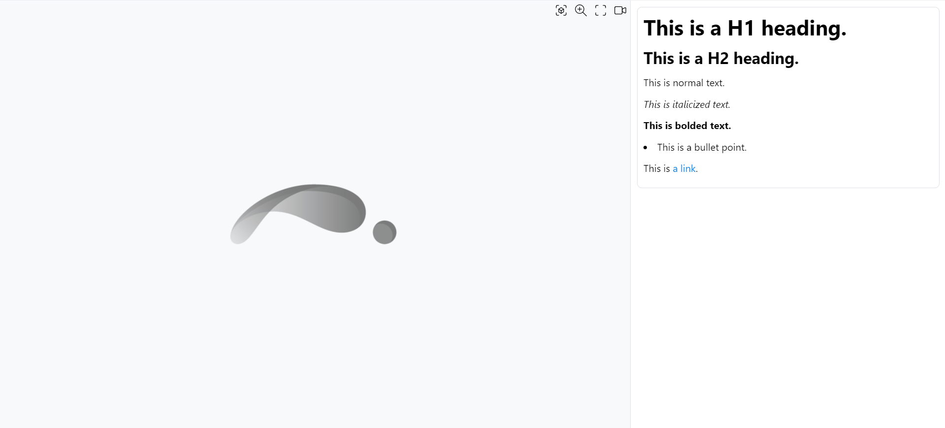
Note that the viewer container is empty in this example, because no display geometry is specified in the definition.
Markdown syntax
The text widget uses the GitHub-flavored version of markdown. The full list of formatting instructions is available here. We recall below some of the basic markdown syntax:
# This is a H1 heading.
## This is a H2 heading.
This is normal text.
*This is italicized text.*
**This is bolded text.**
* This is a bullet point.
This is [a link](https://docs.github.com/en/get-started/writing-on-github/getting-started-with-writing-and-formatting-on-github/basic-writing-and-formatting-syntax).
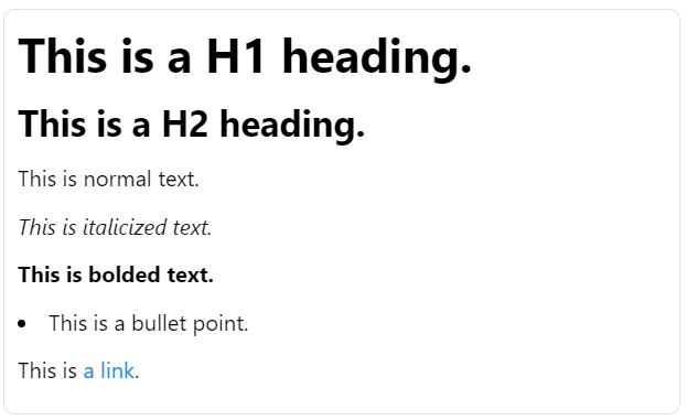
Table formatting
The version of markdown supported by the component allows the formatting of tables in the text panels.
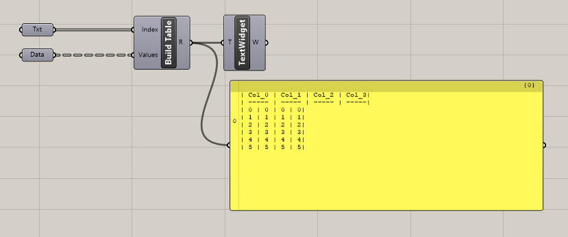
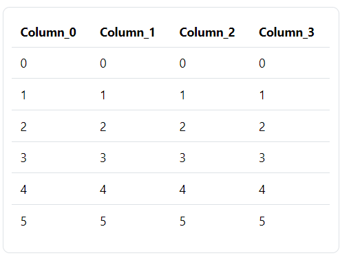
Download an example Grasshopper definition including a cluster to easily format tables for the text widget.
Text formatting with the ShapeDiver extensions
The following syntax can be used to format a portion of text:
This is how to color :span[some words in blue]{color="blue"}.

The extension works for coloring, subscript, superscript and underlined text:
:span[This is subscript.]{style="sub"}
:span[This is superscript.]{style="sup"}
:span[This is underlined.]{style="ins"}
Color extension
It is possible to specify some primary colors by their name (such as “blue” in the example above). Alternatively, any color can be specified using its hexadecimal representation:
Use a hashtag in front :span[of the hexa code]{color="#E233F3"}.

One can combine the extension with other markdown instructions:
*:span[This is italic text.]{color="green"}*

The ShapeDiver extension might be used in the future for further improvements of the Text Widget.
