
The Action Control component can be used to create action buttons in an App built with the App Builder components. Each created button is linked to a specific action.
The component allows to customize the button with a label, icon and tooltip, and takes an Action as input, as created by one of the Action components of the plugin.
The created control can then be included in a Controls Widget within the App.
First example
In the example below, we create a simple box with two inputs: a height and a color:
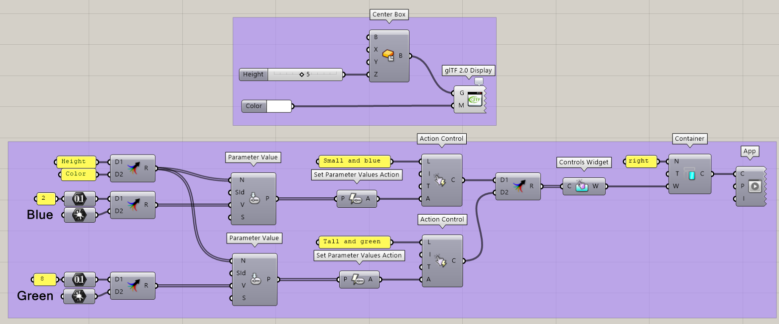
Using the App Builder components, we create an App with a single Container on the right. In this container, we define a single Controls Widget, which itself includes two Action Controls. Both controls link to Set Parameter Values actions:
-
The first control is named “Small and blue” and simultaneously sets the Height parameter to 2 and the Color parameter to Blue.
-
The second control is named “Tall and green” and simultaneously sets the Height parameter to 8 and the Color parameter to Green.
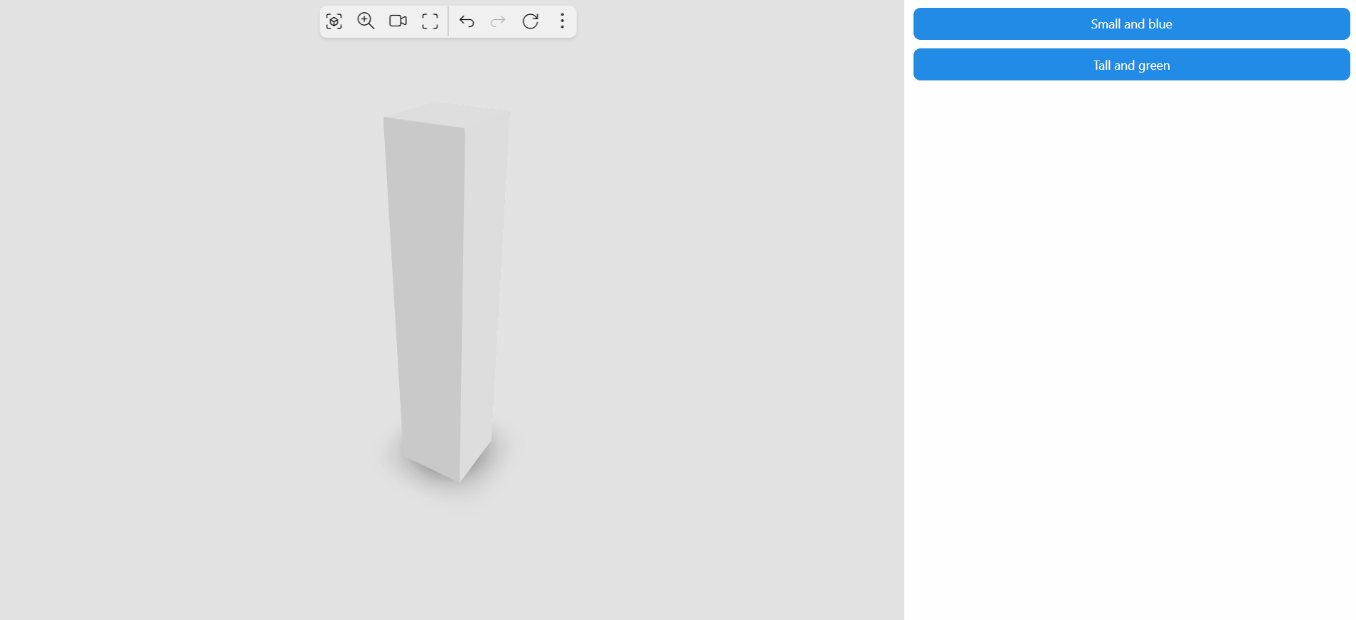
The created App looks as follows:
Read more about the Set Parameter Values action to learn more about this specific action. Multiple actions are available to link with Action Control components.