
Version 1.9
June 18th, 2026
Many small layout and security fixes were included in this release. Additionally, a big update with typing and documentation was done, ensuring much better results when using the ShapeDiver Agent Skills.
Below a list of notable changes:
Improvements:
-
Several updates to the form widget:
-
It includes live validation for text fields.
-
The submit button stays disabled until all fields have passed validation.
-
It is now possible to pass parameter values (in addition to the ones in the form) when clicking on the submit button.
-
-
It is now possible to override the settings of interaction inputs using the Parameter Control settings input.
-
The
modelStateIdURL parameter can now be applied to URLs identifying models using theirticketandmodelViewUrl. -
The
useCloseButtonproperty now also applies to 2D Anchors.
Bug fixes:
-
The Stack Widget now works in floating containers. Also, its contents now dynamically update after recomputations.
-
Floating containers now work as expected when using orthographic cameras.
-
The slider digit scroller is now compatible with snapping values.
-
Scrollable content now displays behind container tabs.
-
The behaviour of dynamic boolean parameters has been fixed.
Version 1.8
April 21st, 2026
New features:
-
Table Widget (beta): this new widget makes it possible to define data tables, and replaces the current method of defining tables using markdown in the Text Widget. It ncludes various formatting options, such as making columns sortable and searchable. It is also optimized for large data sets.
-
It is now possible to override the minimum and maximum values of sliders.
-
Imperial units are now supported by the Points Input labels (point locations and distance between points).
Improvements:
-
Tabs are now sticky: they are always displayed on the top of containers even when scrolling through the content.
-
The selection and hovering effects in attribute visualization mode have been switched to color changes for better performance and rendering. Performance in attribute visualization has been overall improved as well.
Bug fixes:
-
Stack Widget titles are now aligned consistently with the Accordion Widget.
-
Exporting and importing file input values from JSON files works again.
-
Switching the resolution of screenshots used as parameter sources now works.
Version 1.7
February 26th, 2026
New features:
-
Form Widget (beta): This new widget makes it possible to create a form with various inputs that are only set at the time of requesting the export, instead of updating the App’s state. This is in particular useful for letting users of the App include information (name, email, order details, etc…) when they trigger a Download or an Email Export. The Form Widget component does not yet exist in the plugin, but it is already possible to create a form using Json objects in Grasshopper. Find a beta tutorial here.
-
Marks and labels for sliders (beta): it is now possible to add marks and labels to slider inputs at custom locations defined in Grasshopper. It is also possible to restrict moving sliders to the defined marks. Find a beta tutorial here.
-
Set Camera Action (beta): A new type of action allows to trigger a camera movement in the viewer. Find a beta tutorial here.
Improvements:
-
Embedded iframes can now copy model stated IDs to the clipboard.
-
App controls are now disabled while an interaction parameter is active.
-
In parameter validation mode, the “Accept” and “Reject” buttons have stronger colors by default.
Version 1.6
November 28th, 2025
New features:
-
Saved States (beta): The widget is included by default (Apps without App Builder components) when models include saved states that the current viewer has permissions to see and load. The widget will soon be available as a component for Apps defined in Grasshopper with the App Builder components.
-
Stack widget (beta): The new stack widget provides an alternative to accordions as a way to organize the contents of App containers. Currently the stack widget can only be defined using Json objects in Grasshopper, but it will soon get a component in the plugin. See a beta example here.
Improvements:
-
It is now possible to instantiate ShapeDiver models in a single App without using a theme file. See the beta example here (“Control instances of other ShapeDiver models”).
-
Custom images can be attached to model states created using the Create Model State Action component.
-
3D Anchors can now be hideable behind scene geometry, using the new
hideablesetting. This feature is disabled by default for performance reasons. -
Value Lists with the type “Check List” are now compatible with images defined using the Value List Settings component.
-
The extended logging system can now output many new warnings and errors to the console.
-
Improved management of model states and saved states (clearing query parameters).
Bugs:
-
Clicking on objects in attributes visualization mode now works on mobile devices.
-
The bug involving empty desktop client outputs in Apps has been fixed.
-
Hiding the JSON menu from Apps using the corresponding model setting works again.
Version 1.5
October 13th, 2025
New features:
-
The “Sources” input of the Parameter Value component is now implemented in Apps:
-
Screenshots of the viewer can be sent to Import Bitmap components.
-
Model State URLs can be sent to Direct Text Input components.
-
More sources will be available in the future.
-
-
The “Parameters” input of Export Control components is now implemented in Apps: it is possible to request export with custom parameter values.
-
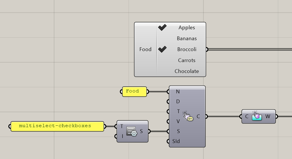
For Value Lists of type checklist, a new visualization using a checkbox group is available:
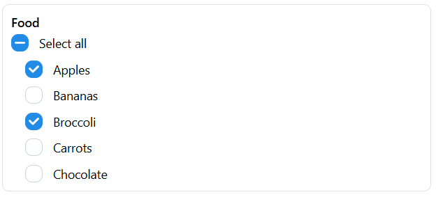
Use the multiselect-checkboxes type setting in the Value List Settings component to enable it:
Improvements:
-
Shopify: when adding an item to the cart, the URL of the image associated with the model state is included.
-
It is now possible to delay the loading of sessions referenced in the theme file, using the
loadOnFirstUseproperty.
Bug fixes:
-
The
imagedropdownvisualization for value lists now shows the correct tooltip. -
Text widgets inside accordions do not display a shadow anymore.
-
Model state links are now correctly generated from inside iframes.
Version 1.4
September 22nd, 2025
New features:
-
This release includes a major update of the App Builder schema, including new layout components and logic and new action mechanisms. These updates are currently in beta until the corresponding Grasshopper plugin components are released in the next few weeks.
-
Additional beta features include:
-
The attribute visualization mode now allows clicking on elements in the scene and to reveal the values of the stored attributes for this object. See an example here.
Improvements:
-
App Builder now supports the entire tabler icon library (instead of a small selection of hard-coded ones). Just use the name of the icon in tabler along with all App Builder components that support icon inputs.
-
Apps now provide feedback in case an Image Widget is linked to an Export component which does not exist or failed.
-
The Selection Input now automatically validates the selection after an object is selected if
max==1. -
The undo/redo buttons and the parameters menu are now disabled in parameter validation mode.
-
The camera menu is hidden if only one camera is available.
-
The default passive material in attribute visualization mode is now light gray and supports shadows.
-
Gumball inputs now work in Apps with multiple instances.
Bug fixes:
-
Importing json parameter values now works as expected also for dynamic parameters.
-
Fixed number validation for the text input component of sliders.
-
Resetting the value of Gumball Inputs now works as expected.
-
The undo button now works from the first customization request.
Version 1.3
August 6th, 2025
New features:
-
Viewport Icons: The viewport icons, which are by default displayed at the top of the viewer canvas, have undergone a styling overhaul and include new features. These new features are:
-
Parameter History: It is now possible to go backwards/forwards in the history of the computations.
-
Reset to default values: It is now possible to reset to the default values of the model.
-
Import/Export parameter values: Import or Export parameter values via a JSON file.
-
Create/Import model state: Create or Import a model state.
-
Improvements:
-
Added overline text decoration to the markdown extension.
-
Updates to the new Geometry SDK version.
-
Various fixes and improvements for the Attribute Visualization.
-
Improvements for the usage of multiple GH instances.
-
Multiple new styling properties are exposed to theme configuration files.
Version 1.2
July 7th, 2025
New features:
-
Attributes Visualization. The widget is included by default (Apps without App Builder components) when models include the ShapeDiver Output component. It can also be added manually in Apps defined in Grasshopper.
-
Desktop Clients. The widget is included by default (Apps without App Builder components) when models include structured inputs and/or outputs. It can also be added manually in Apps defined in Grasshopper.
Documentation in progress!
Improvements:
-
Value lists with images can be defined in Grasshopper. It is also possible to define a visibility per item in order to dynamically hide or show single options.
-
Accordions are displayed with a shadow.
-
Support for subscript, superscript and underlined text markdown tags for the Text widget.
-
Labels visibility can now be defined in Grasshopper for the Points Input.
-
Multiple new styling properties are exposed to theme configuration files.
Version 1.1
May 30th, 2025
First recorded App Builder release, including all features developed up until now. From this release onwards, all version number increases will be recorded on this page, including a list of the notable changes. For the record, this release includes the following major updates from the previous internal App Builder version:
-
Support for Value List inputs including images. At the moment, those inputs can be configured through theme properties, but in the near future it will be possible entirely through Grasshopper components. Read how to setup the theme and stay up to date with future progress on this feature here.
-
Improvements to the Points Input widget: it is now possible to rotate the camera during the points editing process.