
Overview
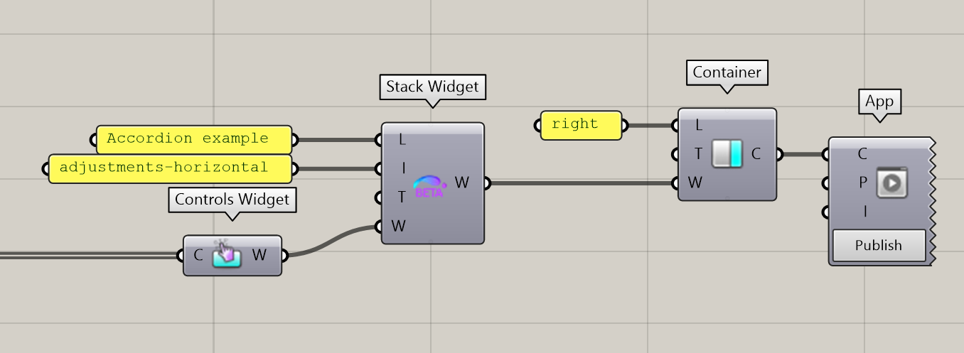
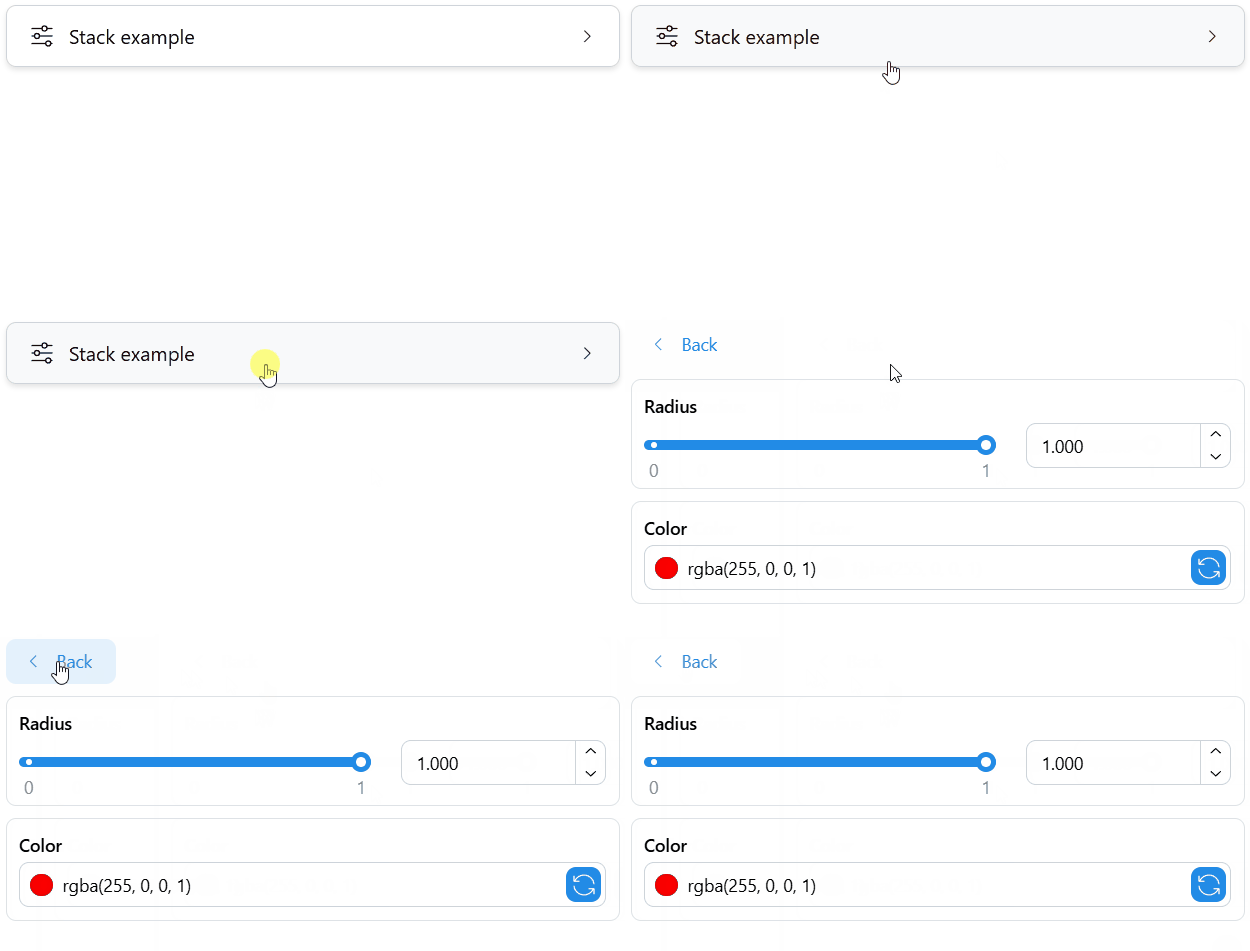
The Stack Widget component can be used along the other App Builder components to group several widgets within a stack element. A stack replaces the contents of the current container with its own contents and includes a back button to navigate back to the parent level.
First example
Download an example definition here.
The resulting UI element looks as follows in the App:
Properties
The component includes inputs to define a Label (L), and Icon (I), a Tooltip (T), and a list of Widgets (W) to include in the stack. Any other widgets of the plugin can be used, including further nested stack widgets.
Outputs
The Stack Widget can then be sent to a Tab or directly to a Container of the App. It can also be included in further Accordion and Stack Widgets.