Overview
Use the Floating Container component to define a “ShapeDiver App Container” object that displays one or more widgets in a floating panel in the App Builder interface, on top of the viewer canvas. You can anchor the container to a fixed 2D point on the screen, or to a 3D point in the scene that updates along with camera movements.
Read more here about the App Builder and how you can use it to drive web applications from Grasshopper.
Floating containers are useful when you want to keep selected controls, information, or actions accessible without placing them inside the main container layout. If you are looking to create a docked container on a side of the main layout, you should rather use the Container component.
2D Anchor Example
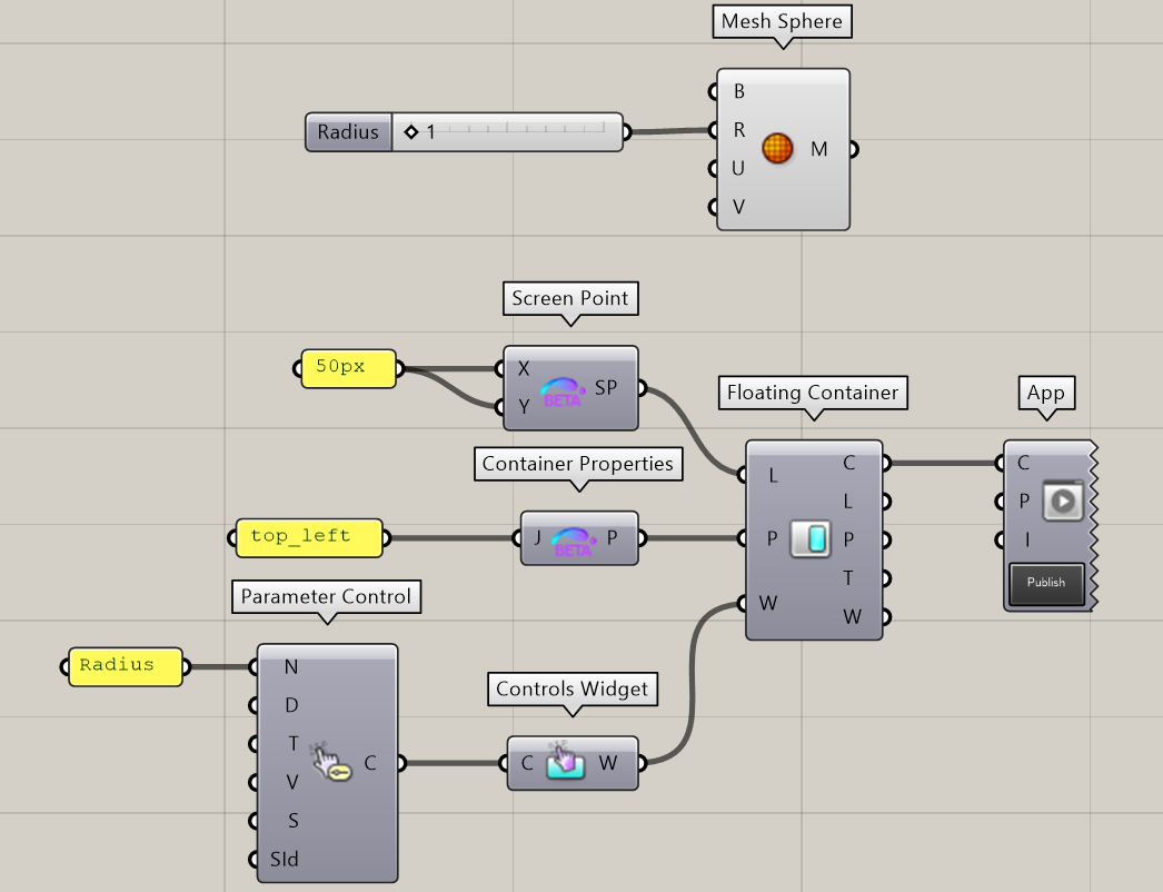
The definition below shows a simple App containing a single input (the “Radius” of the displayed Sphere). It builds a minimal layout including a Floating Container, itself containing a single Controls Widget with the “Radius” parameter.
The Floating Container is anchored to a 2D location on the viewer canvas using the Screen Point component: 20 pixels away in both directions from the top left corner of the viewer canvas.
We also use the Container Properties component to justify the contents of the container to the top left.
The corresponding App looks as follows:
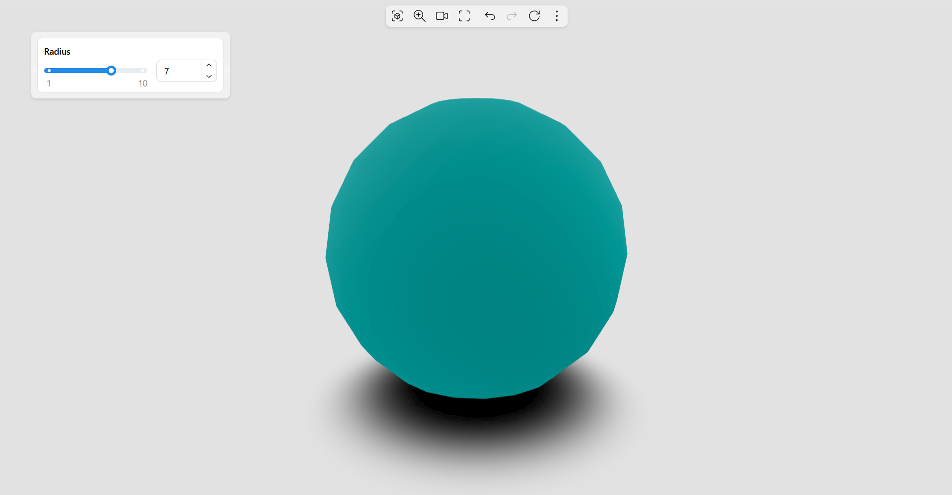
Notice the anchor point at 20 pixels from the top left and the container justified with respect to this point.
3D Anchor Example
The definition below is a slightly modified version of the first example. Instead of defining a 2D location on the screen, we simply send a 3D point from the scene; in our case, this is a point that lies along the Z axis above the sphere.
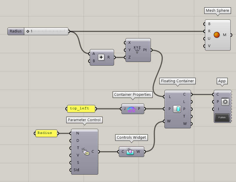
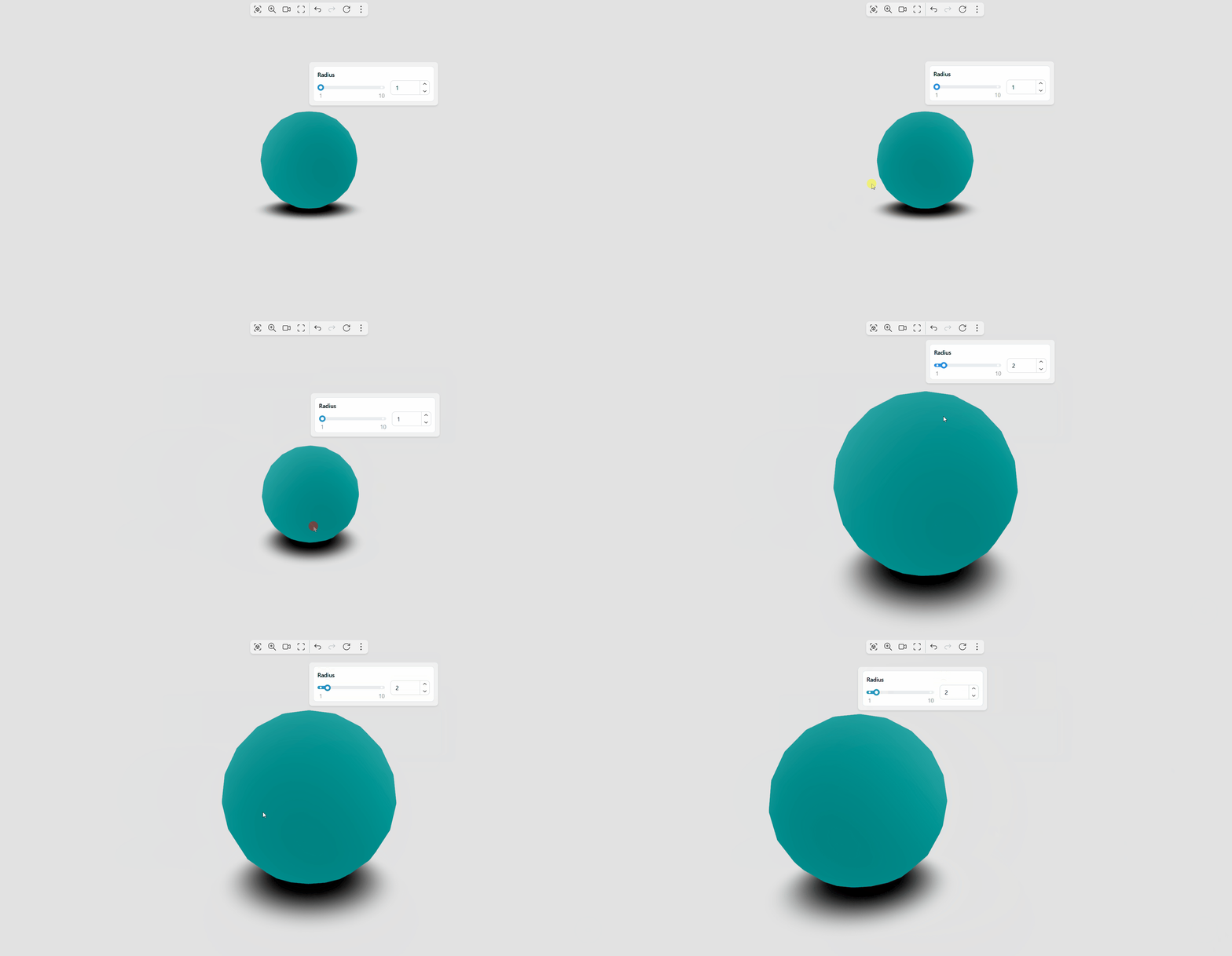
Note that the location adapts to the geometry in the scene: if you change the radius of the sphere, the location of the container adapts to the new state.
The corresponding App looks as follows:
Properties
The Floating Container component accepts the following properties:
-
Location: A location in the viewer canvas where the container is anchored. The location can be one of two types of objects:
-
A standard 3D Point in Grasshopper. In that case, the container is anchored to a point in the 3D scene and will move, rotate and be shown or hidden according to the camera position.
-
A screen point object, as defined by the Screen Point component. You can define the location using the Screen Point component to anchor the container to a fixed 2D location on the viewer canvas.
-
-
Container Properties (optional): An optional container properties object created using the Container Properties component. Use it to customize many styling and advanced properties of the container.
-
A list of Tabs to include in the container.
-
A list of Widgets to include in the container. Both Tabs and Widgets are optional inputs, but you need to define at least one of these inputs for the component to create a valid container.
Tabs or Widgets
As a general rule, use tabs as an intermediary building block between containers and widgets. However, you can define widgets directly inside containers in the following use cases:
-
You do not need to organize the container contents into separate tabs.
-
You need to display one or more widgets regardless of the currently active tab. In the default template, widgets included directly in containers are always displayed at the bottom.
Outputs
Connect the resulting output object to the App component to include it in the final application.