
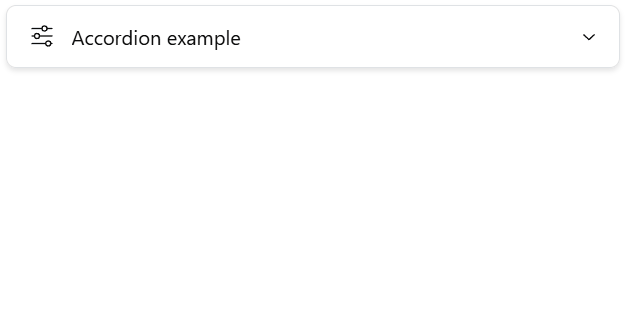
The Single Accordion Widget component can be used along the other App Builder components to group several widgets within an accordion element which can be expanded or closed by users of an App.
Overview
Download an example definition here.
The component includes inputs to define a Label (L), and Icon (I), a Tooltip (T), and a list of Widgets (W) to include in the accordion. Any other widgets of the plugin can be used, including further nested accordion widgets.
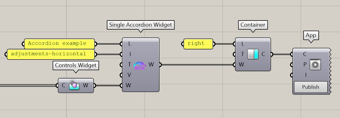
The Single Accordion Widget can then be sent to a Tab or directly to a Container of the App.
Usage within a Multiple Accordion Widget
The Single Accordion Widget can be used alone or along other ones within a Multiple Accordion Widget. The Multiple Accordion Widget can make use of the specified Value (V) of each single accordion to determine its behaviour. If you are using a Single Accordion Widget alone, this input can be left empty.