
Overview
The Slider Mark Item Data component can be used to define a list of value-label pairs to display under a slider control in App Builder. The created list should be sent to a Slider Settings component used to override the slider settings in a Parameter Control.
Usage
The component takes two inputs: the value of the slider where a mark should be added, and the (optional) label to show at the location of each corresponding mark:
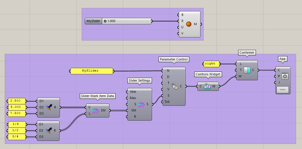
The created Mark Item Data can used as an input to the Slider Settings component. This input accepts a list, which makes it possible to define multiple marks on the slider. The above definition results in the following slider in the final App:
