
Overview
The Slider Settings component can be used to override some settings of Sliders within the App Builder framework, such as the minimum and maximum values, the step, marks and labels.
Usage
Settings created with the Slider Settings component can be injected into the Parameter Control component of the App Builder framework. The injected settings will be used to override default settings of the slider referenced in the Parameter Control component.
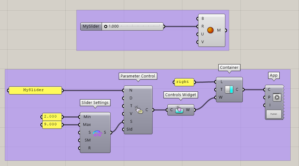
In the example above, the slider called “MySlider” is included in the right container of the generated App. The Slider Settings component is used to override its default min and max values (1.000 - 10.000) with new bounds (2.000 - 9.000).
Note that this method makes it possible to create sliders with dynamic bounds!
Available inputs
The following slider settings can be controlled using the component:
-
Min: Overrides the minimum value of the slider. Must be larger than the minimum defined in the slider input.
-
Max: Overrides the maximum value of the slider. Must be smaller than the minimum defined in the slider input.
-
Step (S): Force the slider to snap its values according to this step, starting from its minimum.
-
Slider Marks (SM): A list of marks to display under the slider control. Marks can be defined using the Slider Mark Item Data component.
-
RestrictToMarks (R): If marks are defined using the “Slider Marks” input, one can force the slider to snap to the marked values. If this input is
true, the “Step” input is ignored.